
 Paulo's Ferrari - 07.09
The Ferrari Modulo created by Paulo Martin while at Pininfarina is one of the cars that moves me most deeply in terms of automotive design. Some critics argue that its not functional, has a horrible turning radius, etc...but i think they miss the point of this vehicle. This design is about hopes and dreams, vision, and inspiration. Ultimately this leads to an excellent brand image boost for Ferrari and Pininfarina at the time. I describe the form language of this design as "Cosmic Geometry," form language that represents the hopes and dreams of the 70's era in terms of advaced space technology, and the dreams of taking mankind further through space exploration. Someday with design i want to do something equally inspiring, that will uplift the people and represent their hopes and dreams in the current or future age.
In terms of painting, i used a horizontal composition to give it a narrative impression. As if reading the image from the left to right or right to left. The top right portion looks like a rear view but it is actually a front of the car with the red stripe bleeding through. Some parts are exaggerated to increase the sense of the dominant profile.
 Dino Rossa - 06.09
This interior piece was a struggle from the beginning to end. It was hard to compose and hard to paint and still not sure if it really is finished. There was a sliver of the cars exterior red showing through because of the A-pillar. I decided to spread this out as an accent and used it in the corners to add more passion with the color and direct your eye back into the composition.
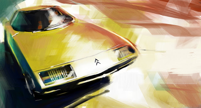 1972 Citroen Camargue by Bertone - 06.09
This was one of those pieces that seemed to have a life of its own. It just came together by itself. I picked some strange colors and they just worked on the first try which almost never happens. What really helps this painting is the dramatic perspective and glaring highlight on the hood and then repeated as an accent in the glass highlight. It makes a nice rhythm of triangles which is an unconscious subtle impression of the Citroen double chevron logo. Now that i've pointed it out i can't stop staring at it.
 Checkmate - 05.09
If not for this painting turning out relatively well i would not have been able to make the others. My semi success wth this first one gave me confidence to tackle the later ones. Although it might not be one of my best in terms of technique it is one of my favorites for what it represents. A first success.
This painting also has a hidden story. The car itself is not even a real car. It is based on a slot racer model.
 Stratos Zero - 08.09